Circling the Declarative Drain
December 16, 2012
Last week I sketched out the rough difference between imperative and declarative approaches to programming, and admitted that I cut my teeth on the former. I alluded to the deep-seated fear and distrust I harbor of declarative approaches, although I didn’t actually write that. So here I am writing that.
Let’s look at a (sort of) modern example: using DIV tags and CSS to lay out a web page. This is a mostly declarative technique in that you don’t tell the browser exactly where to put each element and how big it should be. Instead, you set out some constraints for the elements and let the browser work out the rest. In theory, with sufficient constraints, you should get precisely the behaviour you want by expending a tiny fraction of the coding effort that would be required if you approached this imperatively.
Let’s pretend for a moment that we lived in a world where this was actually the case. What would such magical markup look like? What is declarative at its best?
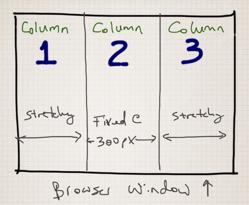
I present to you the classic1 fluid-fixed-fluid 3-column layout. Your web page is divided into three vertical columns. The middle column is fixed to a width of exactly 300 pixels. The left and right columns grow and shrink evenly to fill up the remainder of the available browser width2.

Figure 1: Thar she blows
What if we had an elegant, semantic and precise markup and styling language to define this behaviour in code?
<head>
  <style>
    body { width: 100% }
    div { height: 100% }
    .fixed { width: 300px }
    .fluid { /* I don't even need to put anything here because it would be redundant */ }
  </style>
</head>
<body>
  <div class=fluid>This is the left column</div>
  <div class=fixed>This is the center column</div>
  <div class=fluid>This is the right column</div>
</body>
You may quibble with my making it look like modern-day HTML and CSS, but you’ll agree that this is fairly concise and semantic: it doesn’t take long to read, and it’s pretty clear what I’m trying to accomplish. The key is in the <style> tag near the top: see how little CSS it takes to make things work in my imagination?
There are a couple of ways to make this happen in actual HTML and CSS, and they’re all horrific. Take a look at this representative example, which I tried to use a couple of weeks ago. Much as I wrote in 2008, I ran screaming back to tables around the time I started trying to get more than 2 browsers to work at the same time.
But even if this solution did work on lots of browsers (it doesn’t), and even if it didn’t suffer from a handful of other annoyances (it does), just take a look at the markup required. I SAID LOOK AT IT. And weep as I do.
Next week, if I’ve recovered my composure, I’ll use this one example to make a broader hypothethis about why this happened, and continues to happen, with declarative approaches to programming problems.
Footnotes:
Classic only to me, in the sense that I bang my head against it every few years so it feels like an old, familiar, foe.
See what I just did there? I declared an (almost) complete specification for the behaviour of our page. That’s how we’ll be doing this 50 years from today, or today, if we can just delegate this whole mess to the intern.
